Instructional Designers Must Take Mobile Learning Design Seriously
Committed instructional designers on the pulse of modern learners’ needs are sure to have encountered instances where mobile learning seems like the best format of training. Mobile learning in practicality is a great option to train people with limited access to conventional computer setups such as PCs and laptops. Mobile learning also appeals to professionals working in profiles such as sales, on-field service, and other on-field job roles.
Additionally, the market for smartphones is growing at a rapid pace, everybody owns a smartphone and it’s a default extension of humans across the globe. As smartphone technology advances and more professionals spend an increasing amount of time on their devices, one cannot ignore this growing demographic, especially in the context of training, as not using a smartphone to support modern training would appear as inefficient or a lost opportunity.
This is one reason why the mobile learning space is growing at a rapid pace. Some research houses estimate the mobile learning market at $37.6 billion. These estimates are indicative of strong demand for mobile learning solutions. As a result, instructional designers need to factor in this booming growth and capitalize on the mobile learning market.
2 Questions to Ask When Designing Mobile Learning
-
How are instructional designing concepts changing to address mobile learning design needs?
-
When it comes to designing mobile learning, what aspects of instructional design are greatly affected?
For starters, instructional designers must understand that designing mobile learning is different when compared to designing traditional eLearning. Even if it is a sub-category under the latter.
5 Instructional Design Tips to Improve the Mobile Learning Design Process
Understand Your Learners’ Mobile Usage Patterns
Mobile usage patterns indicate that learning on mobile devices is usually consumed when the content is presented in micro-sized chunks. When researchers studied the the training consumption patterns of PC users, they realized that learners did not mind consuming slightly bigger chunks of content. This does not mean that the content was not microlearning, rather, it meant that PC users were ok with consuming longer microlearning modules that what was first assumed, However, researchers then noted that learners often switched to mobile phones during periods of free time. During their time using mobile phones, people were most often consuming much smaller chunks of content when compared to their PC usage.
With this information, you can now proceed to design mobile learning courses with the intention of capturing your learner’s attention during their free time.
The best way to do this is by designing engaging mobile learning which is presented in microformats. Additionally, ensure that the training is presented with plenty of media because an image and video rich content is more likely consumed by learners on a mobile phone when compared to text-heavy training. Additionally, you can opt to include some form of social interaction modules which makes use of the messaging functionality of your mobile phone to encourage social learning among learners.
Some other points one must consider are to keep the training lite and clutter-free because the small screen size of a mobile phone plays a big role in how easily learners can interact with the content.
Designing Mobile Learning to Fit Compact Screen Sizes
As an Instructional Designer, understanding the relationship of a mobile screen size or active view-port size of the device and the type of eLearning course is very important. When talking about designing mobile learning, approach the problem with the mindset of ‘less is more.’ Actively choosing minimalistic design elements to compensate for heavy text content works well on small screen sizes. The same principle applies to images and visuals. It really boils down to what makes more sense on a small screen. The answer is ‘content that really matters must always takes precedence over any other elements.’
To correctly optimize courses for mobile, designers should also consider the use of mobile-friendly fonts, colors, and graphics that are easy to read and view on a smaller screen.
In terms of layout, eLearning courses should be designed to load quickly on mobile devices. This can be achieved by optimizing images and videos, minimizing the use of animations, and ensuring that the course is compatible with multiple mobile devices and operating systems. Additionally, the course layout should be responsive, adjusting to the screen size of the device to provide the best viewing experience.
Planning the Navigation On Mobile Phones is Critical to Designing Mobile Learning
Smartphones work on the principle of touchscreen navigation and scrolling. This means that navigation elements packed too close to each other will inevitably cause the learner to face problems when clicking on elements.
Designing mobile learning courses requires careful consideration of how clickable elements are placed on a mobile device and how the layout loads. When it comes to clickable elements, they should be large enough to tap with a finger and placed strategically to avoid accidental clicks. Buttons and links should have enough spacing between them to prevent misclicks. Moreover, the placement of the clickable elements should be intuitive and consistent throughout the course to ensure ease of navigation.
PCs on the other hand work with several active tabs on the same screen. Now on a PC, jumping back and forth between tabs is very simple. But the same does not apply to mobile devices. As a result, eLearning courses on mobile phones work better when the content is provided sequentially as the learner scrolls through the content instead of opening on multiple tabs simultaneously.
Using a Smartphone’s Inbuilt Abilities and Features
If screen size is something that smartphones lack, then they compensate for this with features like mobility, accessibility, and small form factor. Additionally, instructional designers must also consider using mobile-specific features such as geolocation, push notifications, and social media integration to enhance the user experience.
These features can be used creatively to support some if not everybody’s learning needs. And that is ok because the decision to publish courses on mobile phones is only arrived at after studying your learners’ needs. And as stated earlier, mobile learning is not a means to everybody’s learning needs. Instead, it is a means to improve the learning needs of those who truly need it. Also, the abilities of a smartphone can make learning games and interactions much richer and more engaging, especially when paired properly with the existing features of a mobile phone.
Understanding the Limitations of Mobile-Based eLearning
It is also important to know that eLearning for larger screens has so far proven to be better in terms of accessibility as compared to eLearning on mobile phones. There is a lot more you can do on larger screens in terms of animations, interactivities, and overall learning experience. There really isn’t a limit to how creative you can get from an instructional and visual design point of view when you design for large screens. However, everything waters itself down when you design for smaller screens. When you design mobile learning, the important factor here is the audience you are catering to like people on the field with no access to desk machines. So, the priority is making content accessible in the most flexible format. Leave out the animations and fancy interactivities. Simplicity is key. So, it is best to truly understand and assess the need for mobile learning before deciding on the approach you will take.
What Do These Tips Mean for Instructional Designers Interested in Designing Mobile Learning Courses?
These differences mean that simply porting your browser-based training onto a mobile device will not work the same as expected or intended. Instead, the mLearning course will have to undergo its own designing stage; independent of how the browser-based course work in order to correctly function on mobile devices.
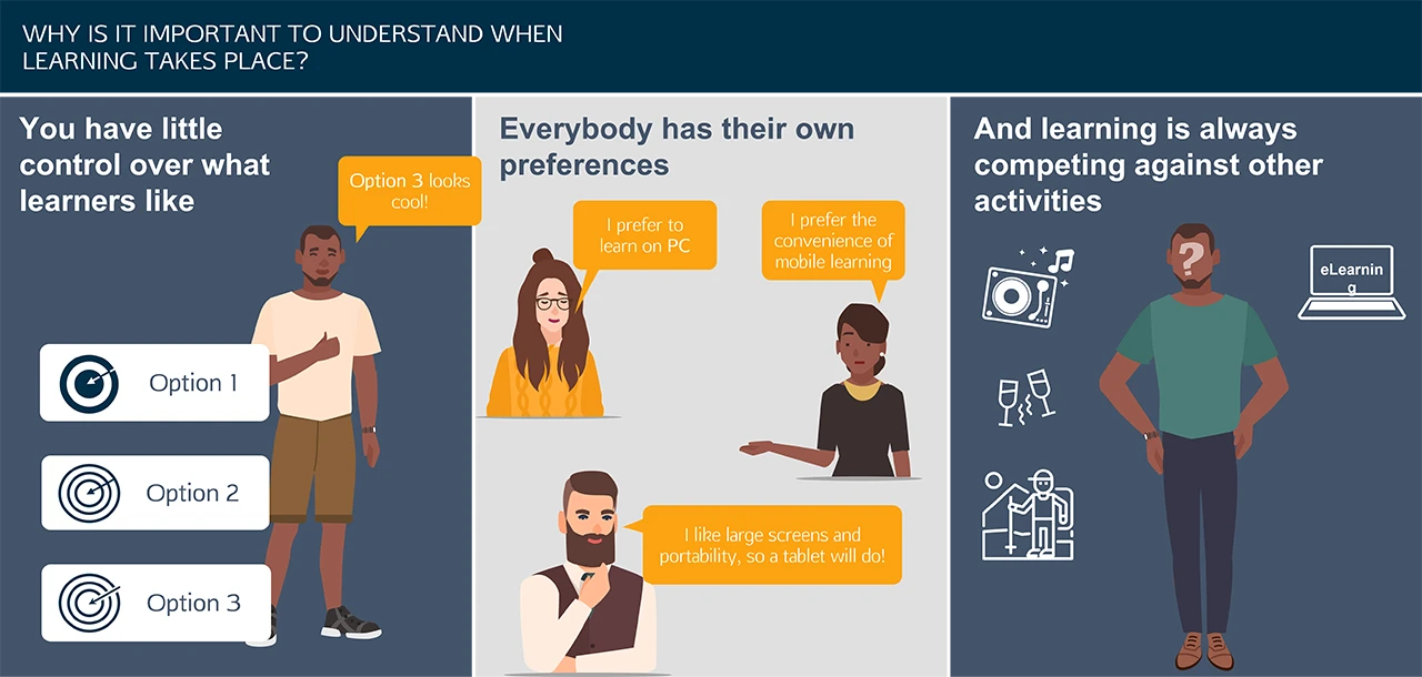
Also, there is a reasonable chance that learners will not exclusively stick to their mobile phones. Especially to fulfil all their learning needs. They may move across multiple platforms depending on what suits their current needs. This factor alone will majorly impact the way learners interact and use your course.
On the other hand, the possibilities of using big data and analytics to process all the information that a user generates when operating their device is limitless. This data can be used to further fine-tune the mobile training initiatives as more training is rolled out.
In the end, the aim of an Instructional Designer is to improve the quality and effectiveness of the instruction.
Mobile learning is already making a significant impact in the training and development world, so Instructional Designers have no choice but to respond to that demand and remember, “Design is not just about how it looks and feels, it is also about how it works.” – Steve Jobs.
On a parting note:
Designing mobile learning courses requires a comprehensive approach to ensure that clickable elements are strategically placed, the layout is optimized for mobile devices, and the course is designed to load quickly and provide an engaging user experience. By considering these factors, designers can design effective mobile learning courses that are optimized to provide learners with a seamless learning experience on the go.
We are eNyota Learning, serving the eLearning development needs of global corporates since 2007. Our team of professionals comprise of experienced instructional designers, storyboarding professionals, software developers, and creative experts. We provide a range of services including mobile learning development. Especially for organizations who are looking to train their employees using the flexibility and accessibility benefits of mobile-based learning. To know more, reach out to us at contact@enyotalearning.com or click on this form link and we’ll get back to you. Also check our learning management system Abara LMS, we are offering a 30-day free LMS trial, test is now!


